Telemetry Data Visualization
The client was in the process of migrating their internal customer portal from ColdFusion to a modern platform.
My responsibilities were only to create very specific components that would help his customers visualize historical data collected from various field monitoring sensors. The client would later take the stand-alone components and add them where needed in the main application.
All charts were made with ChartJS inside custom Vue components.
Clients comments
Maurice is great to work with, and his work product is excellent - well thought out, clear and working. Great at collaboration and helping explain the underlying technologies.
Screenshots
 Based on the data fed to the chart, it would compare utilization data for the current month (green) with last months (gray)
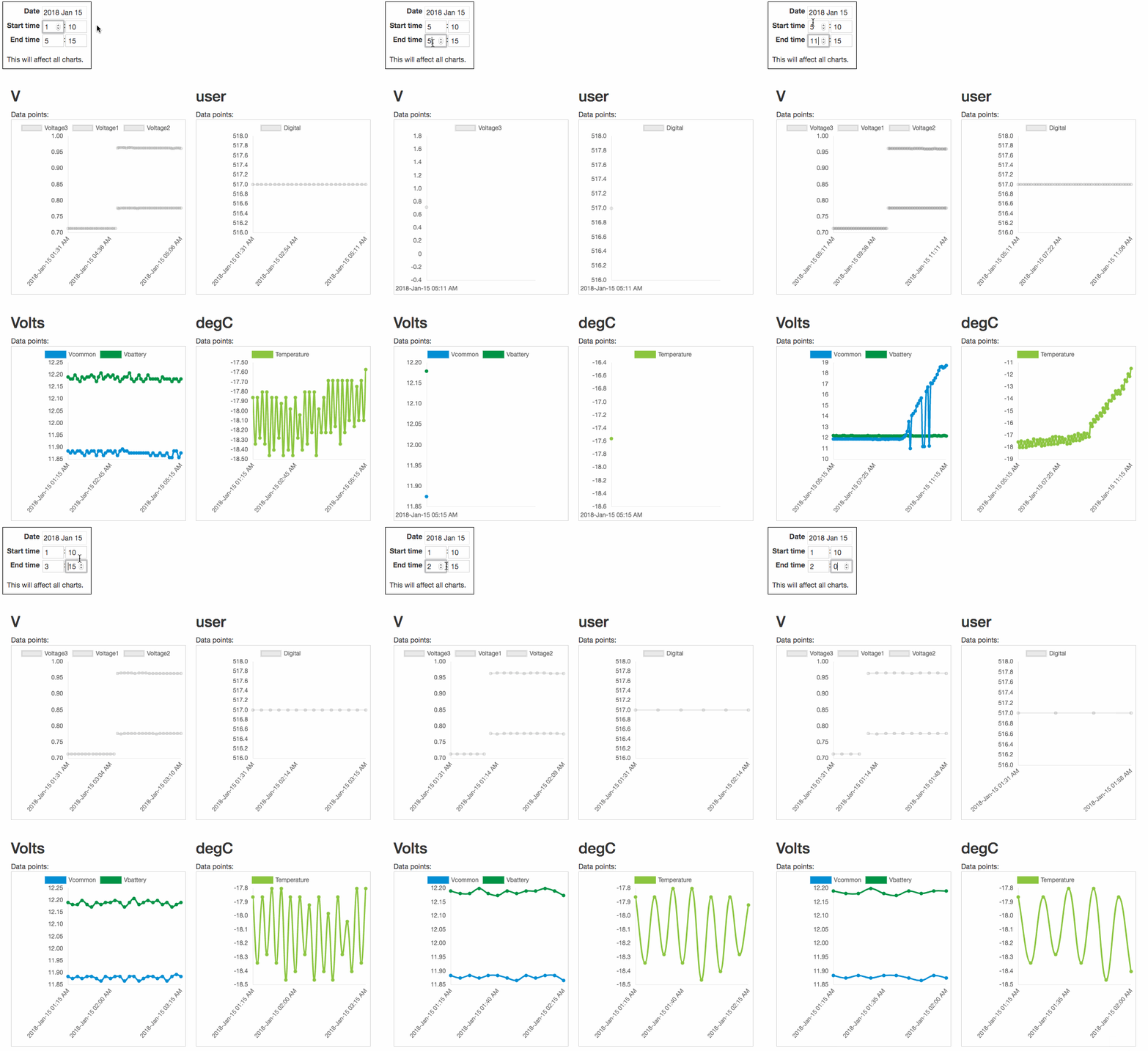
 Visualization for multiple metrics with in a given time frame. As the user adjusted the date/time window, all charts would dynamically update